

In today’s digital world, having a responsive website is essential. With more and more people accessing the web on mobile devices, it’s crucial for websites to be designed with responsiveness in mind. In this blog post, we’ll explore the best practices for building a responsive website in 2023.
- Design for Mobile First
With the majority of web traffic now coming from mobile devices, it’s important to design for mobile first. This means designing your website with mobile devices in mind, and then scaling up to desktop devices. By designing for mobile first, you can ensure that your website looks great on all devices, and that it’s easy to navigate and use on smaller screens. - Use a Responsive Framework
Using a responsive framework is an easy way to ensure that your website is responsive. A responsive framework is a set of pre-designed templates and stylesheets that are designed to work on all devices. By using a responsive framework, you can save time and ensure that your website is fully responsive without having to create custom designs for each device. - Optimize Images and Videos
Large images and videos can slow down your website and make it difficult to load on mobile devices. To ensure that your website is fast and responsive, it’s important to optimize images and videos for the web. This can include compressing images, using lazy loading for videos, and choosing the right file format for each image or video. - Use a Fluid Layout
A fluid layout is a design technique that allows your website to adapt to different screen sizes. Instead of using fixed widths for your website, a fluid layout uses percentages to ensure that the design scales up or down to fit any screen size. This ensures that your website looks great on all devices, from small mobile screens to large desktop monitors. - Test on Multiple Devices
One of the most important steps in building a responsive website is testing it on multiple devices. This ensures that your website looks and functions as intended on all devices, and that there are no issues with the layout or functionality on specific devices. It’s important to test your website on a variety of devices, including smartphones, tablets, laptops, and desktops. - Use Responsive Typography
Responsive typography is a design technique that allows your website’s typography to adapt to different screen sizes. This ensures that your website’s typography is legible on all devices, and that it doesn’t become too small or too large on smaller or larger screens. Responsive typography can include things like using different font sizes and line heights for different screen sizes, and using scalable fonts like SVG. - Minimize Page Weight
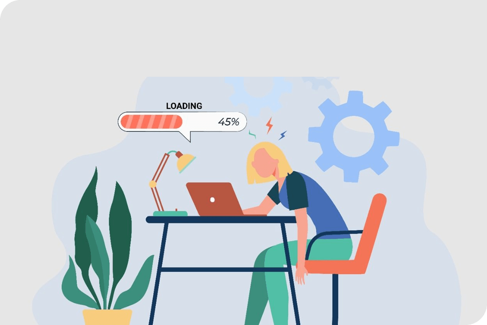
Page weight refers to the total size of your website’s files, including images, videos, scripts, and stylesheets. The larger your page weight, the longer it will take for your website to load, especially on slower internet connections. To ensure that your website is fast and responsive, it’s important to minimize page weight by using efficient code, compressing images and videos, and minimizing the use of scripts and stylesheets.
Conclusion
Building a responsive website in 2023 requires careful planning and attention to detail. By following these best practices, you can ensure that your website is fully responsive, fast, and easy to use on all devices. From designing for mobile first to testing on multiple devices, each of these best practices plays a crucial role in creating a website that is optimized for the modern digital world. With a responsive website, you can reach more users, increase engagement, and build a strong online presence for your business.
At Sidat Technologies & Digital, we can help you build a fully responsive website that provides a seamless experience for your visitors, regardless of the device they’re using. Contact us today to learn more about our responsive web design services and how we can help you create a website that engages visitors and drives results.


